IstoVisio (syGlass) Menu Redesign | B2B
Boosting User Return by 10% with a Streamlined Menu Redesign
At IstoVisio Inc., I led the end-to-end UX redesign of syGlass, a VR platform that empowers scientists to explore complex 3D data beyond the limits of traditional 2D visualization.
Trusted by research communities across the US and Europe and frequently cited in top-tier publications, syGlass experienced a 23% user growth from 2022 to 2023. Over 10 months, a complete UX overhaul drove an 80% increase in customer satisfaction and successfully won back 10% of former users after the launch.
MY ROLE
Lead UX/Product Designer (Research, UX, UI)
THE TEAM
Lead Engineer, Engineer, UX Consultant
Problem
Users found the current menu confusing and hard to use. It was difficult to find key features, leading to frustration and frequent support requests.
Business Goal
STATUS
Launched: May 2024
Enhance User Satisfaction: Deliver a seamless, intuitive navigation experience that reduces friction and boosts overall UX scores.
TIMELINE
August 2023 - April 2024
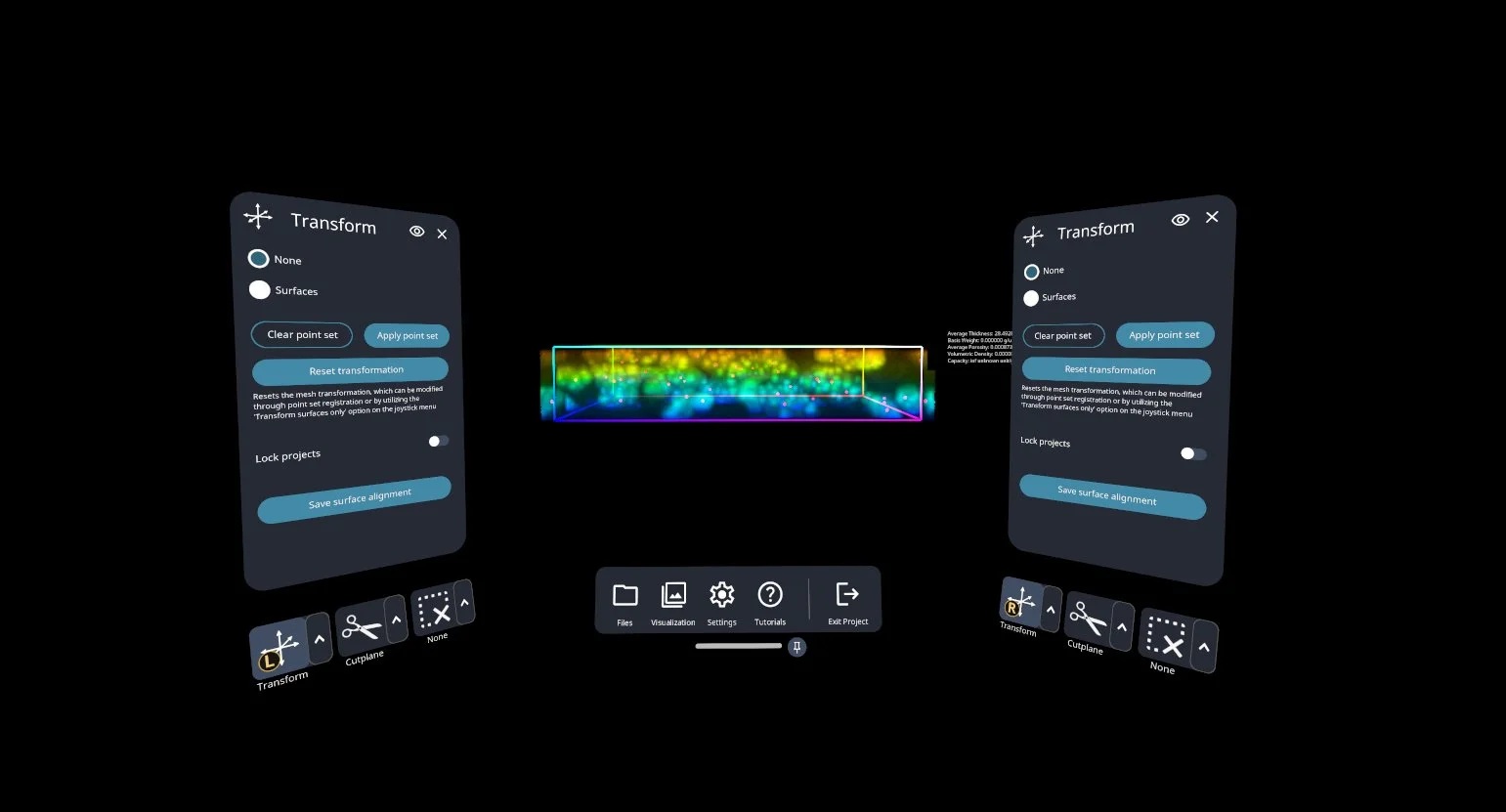
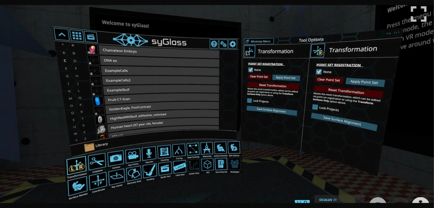
OLD vs NEW DESIGN
What is syGlass Software?
syGlass is a VR tool that helps scientists and healthcare professionals explore complex data in 3D. Instead of looking at flat images, they can step into the data, see it from all angles, and better understand what it means—just like how designers use Figma to work more easily and visually.
Who are syGlass users?
Scietists
Researchers in fields like neuroscience and cell biology who use syGlass to explore and analyze large-scale 3D and 4D microscopy datasets. They rely on precise, interactive visualization tools to uncover patterns and insights critical to their work.
Healthcare professionals
Imaging specialists who use syGlass for advanced anatomical visualization. They value intuitive navigation and high-fidelity rendering to communicate complex medical information effectively.
DISCOVER
To understand usability challenges, I worked with a UX consultant to lead user research. Over two months, we conducted 14 in-depth interviews across 5 countries to find workflow problems and discover user pain points.
KEY INSIGHTS:
DEFINE
The research revealed that the menu system was confusing and difficult to use, causing frustration and slowing down users' work.
How might we redesign the menu to:
Give users more control by allowing them to customize menu placement.
Make navigation easier so frequently used tools are quick to access.
Improve feature visibility to help users find and use powerful tools.
EXPLORE
I facilitated brainstorming sessions with engineers and a UX consultant to explore high-level concepts for “How Might We “ questions. I proposed a two-step approach - first, zooming out to focus on layout and tool selection, then zooming in to refine features and micro-interactions for customization.
Here are some of the ideas we explored:
The challenge was to enhance usability without disrupting muscle memory or workflow efficiency. Since syGlass is precision-driven, reducing complexity wasn’t an option. Instead, the focus was on minimizing cognitive overload, making interactions more intuitive while preserving user control.
For tool selection, I aimed to solve two key problems: reducing clicks to streamline workflows and ensuring selected tools remained persistent until the user manually changed them.
DESIGN
How Might We Enhance Usability Through Customization?
Pain Point – Fixed menu placement forced rigid interactions, leading to frustration, inefficiency, and physical discomfort.
Solution:
Pinned & Movable Menus → Allowed users to position menus for a personalized setup.
"Always Visible" Tool Pages → Kept critical tools accessible, improving workflow speed.
By integrating ergonomic best practices with customization, we created a more intuitive, efficient, and comfortable user experience.
How Might We Make Frequently Used Tools Easier to Find Without Disrupting Workflow Efficiency?
Pain Point – Scientists relied on the same two to three tools for most tasks, but the existing menu structure required unnecessary steps, slowing them down.
Solution:
Logical Groupings → Organized commonly used tools into an intuitive structure, reducing cognitive load.
Optimized Placement → Positioned frequently used tools within easy reach to minimize search time.
Quick-Access Menu → Allowed users to pin frequently used tools for one-step activation, eliminating redundant interactions.
By streamlining tool access, we reduced friction, improved efficiency, and helped users stay focused on their tasks.
How Might We Improve Feature Discoverability and Accessibility?
Pain Point – Usability testing showed that many powerful features went unnoticed due to unlabeled icons, making it difficult for users to recognize their purpose.
Solution:
Added Clear Labels → Ensured users could quickly identify each tool’s function without guessing.
Improved Visual Hierarchy → Made advanced features more visible without overwhelming the interface.
Increased Feature Adoption → Made underutilized tools more accessible, encouraging exploration and engagement.
By refining feature presentation, we eliminated ambiguity and empowered users to unlock the platform’s full potential effortlessly.
EVALUATE
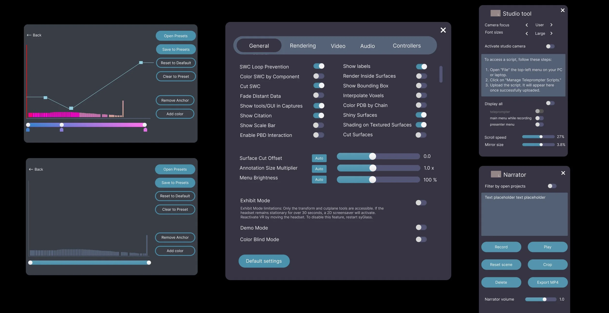
I led two rounds of usability testing with 8 participants to validate the improvements. Using a task-based think-aloud method, I observed how users interacted with the new menu system, capturing real-time feedback on efficiency, discoverability, and overall experience.
The goal was to ensure the redesign enhanced workflow speed, reduced friction and maintained familiarity without introducing new usability issues.
Key Testing Insights:
Faster Task Completion → Users located and accessed tools 89% faster, confirming that the improved navigation structure and visual hierarchy reduced cognitive load.
Improved Discoverability → Previously underutilized features saw an increase in engagement, validating that clearer labels and better organization made key tools easier to find.
What Didn’t Work & How We Fixed It
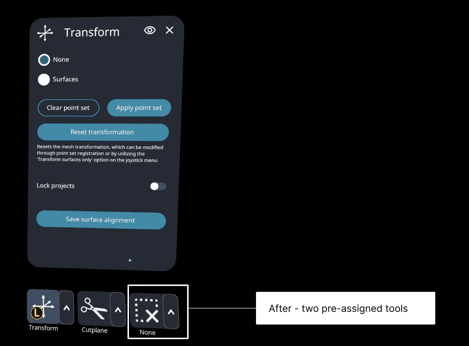
❌ 6 out of 8 users found three pre-assigned tools limiting, as they primarily used two and didn’t want to skip an extra slot. Their third tool changed frequently based on the task.
✅ Updated the prototype to pre-assign two tools, allowing users to dynamically select the third as needed.
🔹 After retesting, 8 out 8 participants adapted seamlessly, confirming a more efficient and flexible workflow.
❌ All 8 users struggled to reopen hidden pages, exposing a critical usability gap.
✅ I introduced subtle animations and a clear indicator bar, inspired by familiar desktop UI patterns, to signal hidden pages.
🔹 All 8 users effortlessly reopened tool pages, confirming the solution was clear, intuitive, and seamlessly integrated into their workflow.
With usability and customization improvements in place, the next challenge was refining the UI - making it more intuitive, visually streamlined, and efficient without disrupting the familiar workflows users relied on.
We aimed to strike the perfect balance: enhancing readability, improving navigation, and modernizing the look and feel while ensuring users could adapt effortlessly.
Key UI Enhancements:
✅ Cleaner Layout → Reduced visual clutter for faster scanning and easier tool access.
✅ Improved Visual Hierarchy → Enhanced contrast, spacing, and grouping to naturally guide users to key features.
✅ Modern Styling → Refined typography, subtle shadows, and polished iconography for a more contemporary, approachable feel.
By combining usability improvements with thoughtful visual refinements, we didn’t just make the interface more efficient—we made it seamless, engaging, and a delight to use.
Reflection: Redesign Impact
The redesign significantly improved overall usability by resolving key pain points in the legacy interface. Simplified navigation and clearer feature discovery allowed new users to onboard more quickly while existing users were better able to find underutilized tools. These improvements directly supported core business goals—boosting usability, increasing user satisfaction, and encouraging long-term engagement.
Opportunities for Improvement
Despite notable gains in efficiency, the inherent complexity of scientific software presents ongoing challenges. To further enhance the user experience, future iterations should focus on robust onboarding support. Interactive tutorials and real-world case studies could empower users to explore the platform’s full capabilities with greater confidence - leading to a more intuitive learning curve and sustained product adoption.
Post-Launch Results: 1 Month In
Survey insights from 32 respondents revealed the impact of the redesign.
10%
Increase in Returning Customers
80%
Increase in User Satisfaction compared with the previous version of the menu.

